1. Shopping List
This project came into existence because I wanted to save time with a household chore, namely doing the weekly food shop.
Previous Approach
The previous approach was for my wife to keep a notebook on the kitchen side where we would write down anything we had run out of and needed from the supermarket.
Then the evening before, we would do our meal plan for the week ahead and the wife would then add what was needed for these meals onto the list.
Pain Point
The issue was that it was inefficient as a new list was started from a blank sheet of paper each week which would use up time. And often the basics (milk, bread etc.) would be missed out. Another issue was that the list wouldn't follow the order of layout of the food leading to either the list being re-written to match or the shopper having to re-trace their steps throughout the store.
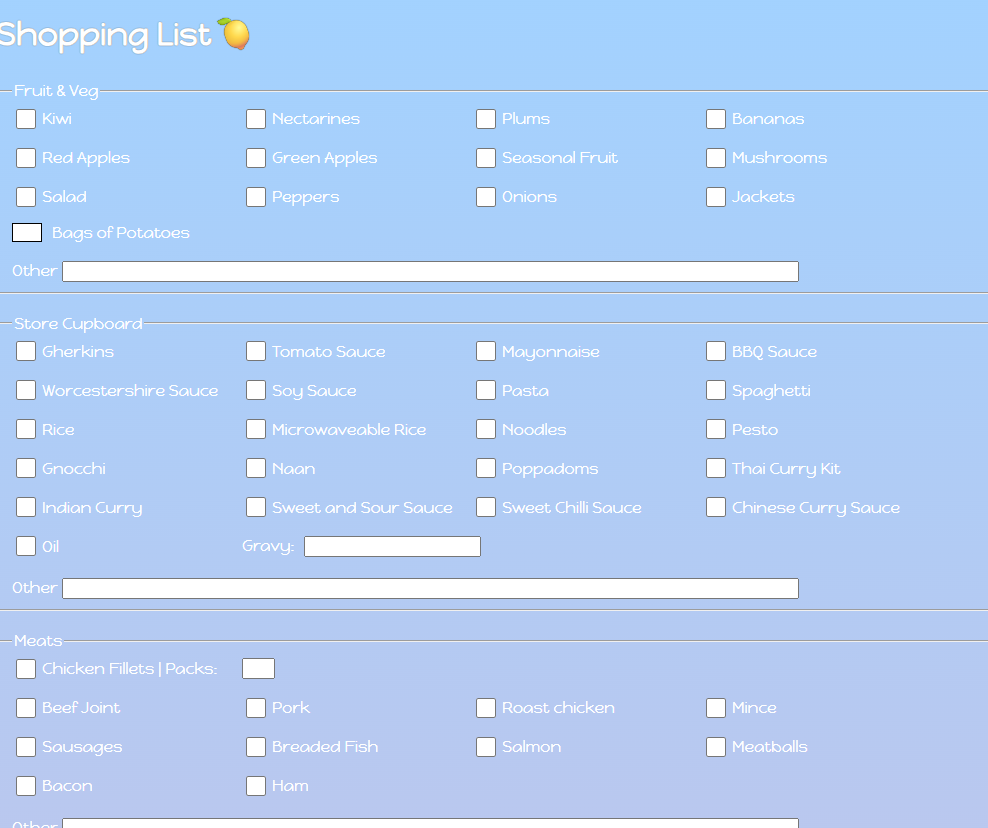
Solution
I built a very simple website in html / css to solve these problems. It is a checklist with the items grouped depending on where they are in the store. Each grouping has a free type field at the bottom so we can add anything that is not regularly required but may be needed ad hoc that specific week.
Each week, a blank checklist is printed out and left on the side. Then if, during the course of the week, we run out of cereal or teabags, this item is ticked in the list.
At the end of the week, we do the meal plan and my wife ticks off the items needed for the week but has the benefit of seeing all items we usually buy so there will be a visual reminder about staples such as milk or bread for example.
The result of this change is a frictionless system which saves us time every single week and ensures we never forget the milk!
2. Mileage Tracker
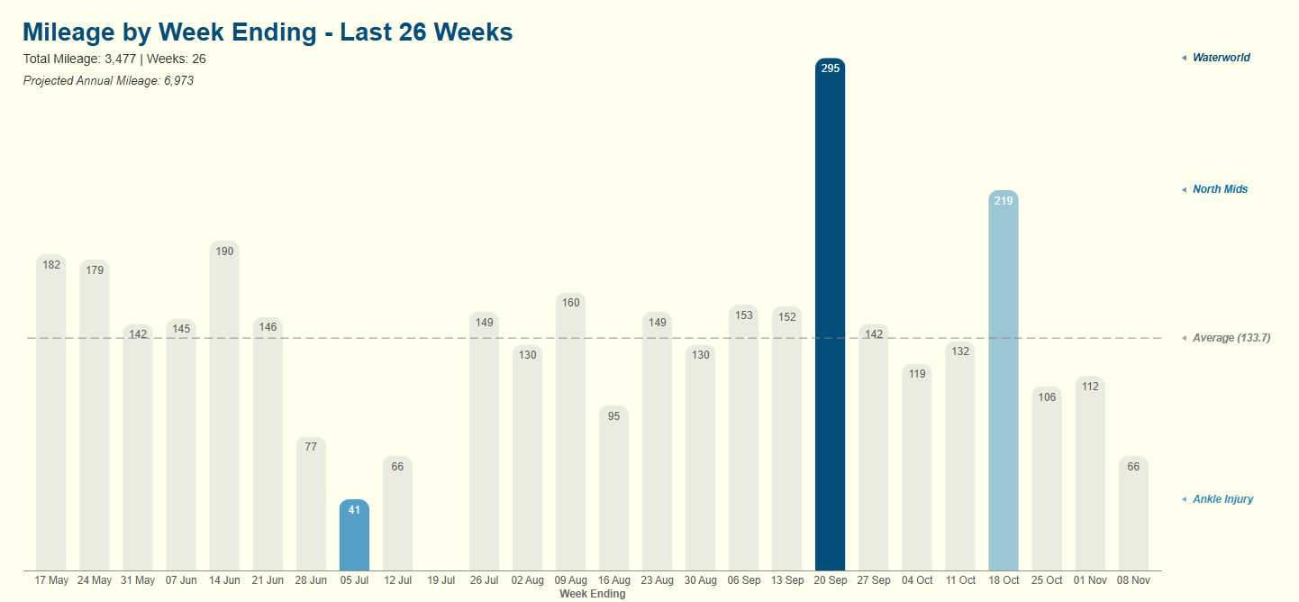
This started with a simple question: "How many miles do I drive each year?"
To find out I began tracking my car's odometer every Saturday in a Google Sheet. Collecting the data like this was just the first step. The real and interesting challenge was the presentation of that data. I wanted a way that was not just accurate, but instantly meaningful.
I used a Deneb custom visual inside of Power BI and this allowed me to fine-tune every aspect of the design to my own individual needs.
A Joy To Use...
Reduction of Chart Junk
The weekly mileage is plotted in subtle grey. This is because this is the background and not the hero. I don't want to call the user's attention to this as this is not the crucial information.
I embedded data labels into the columns themselves. This has two main advantages: it eliminates the need for a Y-axis and brings the numbers into the visual itself reducing cognitive load on the user.
The Narrative
The story is told through strategic highlighting. The columns with the highest, second-highest and lowest values are tinted blue immediately drawing the eye. The chart has a dashed line in grey to give an indication of the average miles per week over the period.
Just underneath the main title, we include a line displaying the aggregate number of miles and weeks over the period together with a calculation returning the projected annual mileage based on this data.
Readability
When a bar is marked as blue, it's data label text colour automatically switches from black to white to improve readability.
Annotations
To the right of the chart, we have included colour-coded triangles and text as annotations. They are included as part of the chart and help explain the reasons for the peaks and valleys (and the average line).
Respect for the User
An off-white background was chosen to reduce eye strain for the user as sometimes the standard bright white background can be uncomfortable if spending any time looking at a visual.
...And Engineered To Last
The elegance and simplicity is maintained by robust engineering. Each week, a new data point is added. Power Query automatically restricts the view to the last 26 weeks and every data label, conditional format, annotation and calculated subtitle dynamically recalculates.
This case study while simple embodies my core philosophy: that every data product, no matter how small, should be a joy to use and engineered to last. Accuracy is the baseline. True craft lies in creating a visual which is intuitive, tells a clear story and respects the user's time and intelligence from their very first glance.
3. Personal website
The Problem
I wanted a platform to share my ideas and philosophy with the world. I could have gone to Wix or Squarespace and used their templated offerings but to me, this didn't feel authentic enough. I wanted more control and understanding of the website from the ground up and these templates didn't serve that want.
The Approach
I didn't want a platform that handled all the behind the scenes stuff and allowed me just to write. Great though they are it wasn't what I wanted. I wanted something that felt more granular, more flexible and therefore easier for me to adapt as I saw fit.
The Stack of Control
In the end, the solution I came up with is a fairly standard setup:
- Frontend: Pure HTML & CSS. No frameworks, no dependencies, no bloat. Back to basics and maximum transparency.
- Version Control: Git with a remote GitHub repository. Every change is tracked and the entire history is preserved.
- Text Editor: Visual Studio Code. A clean powerful editor that I use for other things and so am familiar with and a big fan of.
- Deployment: Netlify takes care of this. All I had to do was link it to my GitHub repository and any future change is deployed and live on the website in seconds.
The Workflow
Having taken care of the infrastructure, it left me with a very simple and repeatable way to add content to the website:
- Write locally in Visual Studio Code.
- Commit changes with a clear message of what the change is.
- Push these changes to the remote GitHub repository.
- Deploy these changes to the Netlify website.(This is taken care of automatically)
The Outcome
I have a fast, clean, minimal website which where I can publish my thoughts in a smooth efficient manner. This is not a one and done either. This is a living breathing project which continues to give:
1. A Continuous Development Environment
I'm constantly looking to improve and enhance the website. This means having to Google and learn how to do things. This leads to continuous improvement in my skillset.
2. A Habit
The simplicity of the workflow removes any friction or effort. I know I can sit down at my desk, write something, click a couple of buttons and within 5 minutes it's live on the website. It makes writing and publishing updates and new content a natural, sustainable process.
3. A Monument
This website isn't just a container for my blog or for my case studies. It is a case study of itself. I've proved to myself that I can architect a solution to a problem from the ground up while understanding the stack and maintaining it with discipline.
The Philosophy
This whole project is a case-in-point for my work philosophy.
It's a joy to use...
The process of building it out in the first place was on the whole relatively straightforward. Now it's all set up, adding new content is painless and is almost as simple as using Microsoft Word.
...And engineered to last
There are no complex parts to breakdown or go wrong. I understand how it works so can fix any problems that may come along. It's simple and easy to maintain.
By creating my own process for this and not using a template website, I've created a platform that is a perfect reflection of the words it presents proving that "a joy to use and engineered to last" is a practice I live by.