Context
We had 2 reports in our suite which, although nobody externally had noticed, were showing signs of slowing. This was a concern and so a spike was added to our workflow to see if there was anything that could be done to proactively improve their performance.
The below is a write up describing the investigation into this.
Problem
Report A and Report B are slow to render. Is there anything that can be done to improve performance?
Background
Assuming a good data model structure and relatively small data size, there are two main reasons why a Power BI page is slow to render:
- Slow Calculations: This can be because the calculations or transformations are complex or the volume of data being processed is large.
- Visuals Rendering Too many visuals need to be loaded or there are complex or custom visualisations on the page.
Investigation
I suspected that since Report B's main page is similar in design to Report A, the issues would be similar between the two reports. I focused initially on Report A.
Performance Analyzer
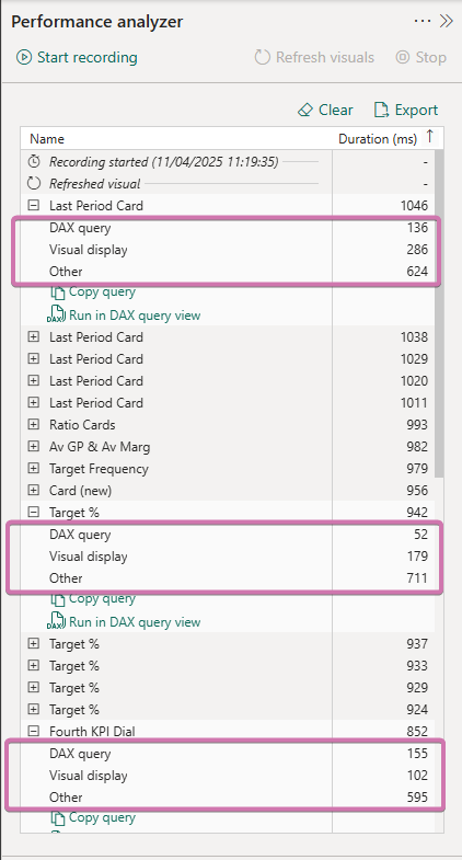
The first place to start is with Performance Analyzer within Power BI. This allows us to see the timings of how long the various objects take to render on the page.
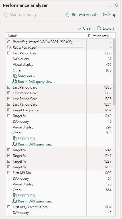
Performance Analyzer split these timings into 3 sections to allow us to see how long each of these sections take:
- The DAX query section tells us how long the calculation has taken to be computed.
- The Visual display relates to time for rendering the visual and
- We have a catch-all section called Other:
What The Timings Mean
In our case, we can see from the screenshot above that the DAX computes extremely quickly in each case. I therefore have no concerns over the DAX being used and don't think it would be a good use of time to focus on streamlining this.
The majority of the time is spent in "Other". While as I say this is a catch-all category, a high value here is indicative of wait time. Power BI is not completely multi-threaded and when visuals are rendered they often have to wait for one to load fully before the next one can begin loading. Cards, in particular, load in series like this rather than in parallel.
Overloading the page with too many objects can significantly impact performance. Each object requires processing power to render. In addition the use of slicers leads to recalculations with every selection and so the more objects that need to be recalculated the slower the page as a whole reacts.
The team view page of Report A has 80+ separate objects that need to be rendered. The main page of Report B has over 120!
Issues Identified
The below issues are common between both reports.
Cards
As mentioned cards tend to render one after the other rather than at the same time. As both reports are "card heavy" this is an area we could potentially look to optimise.
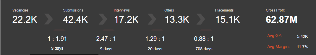
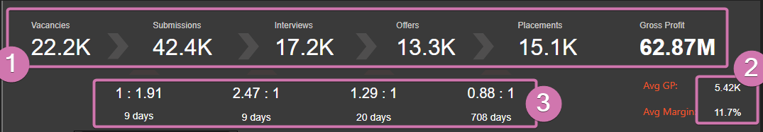
In Report A, the headers are individual cards. As are the ratios and days underneath. And the Average Profit and Avg Margin metrics. A total of 16 cards.
In Report B, all the values under the different sections (Upcoming, Placement Info, Vacancy Info, Business Development) are all individual cards, a total of 30+ cards that need to be rendered.
Background Shapes
On most of our report pages we have made a design choice to use shapes to form a background around distinct elements so that they are visually "lifted" above the background of the page. These shapes take time to load as well and therefore add to the latency. Looking at the Team page of Report A in particular:
- Each dial visual has a background shape.
- Each bar chart visual has a background shape.
- The main logo has a background shape.
- Each pair of ratio / day cards has a background shape. (They also have another triangle shape "pointing" to the chevron above).
- The chevrons themselves are 4 shapes.
- There is a shape behind the two slicers.
- There is a shape behind the header cards.
- There is a shape behind the Avg GP / Avg Margin cards.
A total of 26 shapes that have to be rendered each time the page loads and then re-rendered every time a selection is changed in either of the slicers.
Custom Visuals
Custom visuals take a little bit of extra processing power to render in Power BI and so will slow down the rendering of the page. Each of the dials is a custom visual as this type of visual is not possible using native visuals (or at least not easily).
So the flexibility we gain from having more scope to create an appealing visual is somewhat negated by the longer latency.
We have 5 of these custom visuals that all take a little longer to render than a native visual.
Suggested Solutions
Cards
My suggested solution is to use the new card visual and take advantage of the fact you can add more than one measure at a time to one card.
With this approach we can convert the headers into one multi column card, the ratio and days into a grid card (multi-row and multi-column) and the GP / Margin into a multi-row card. Thereby reducing 16 cards down to 3. The below is done with 3 cards (and has none of the usual styling but hopefully illustrates the point):
I did have to use a couple of text boxes for the Avg GP and Avg Margin labels as the card visual only allows you to choose a label above or below the value, not to the side. Although this means you are adding a couple more objects to the rendering time, we can optimise these labels further by ensuring they do not interact with any of the slicers or visuals. So that once the page is rendered, they never get re-rendered by any other changes in the report.
Background Shapes
These shapes are used to create a background layout on the report page. There are three options I can come up with to improve the performance with these:
- Remove interactions between the shapes and any interactive element on the page (slicers, drop-downs, bar charts etc) to avoid them re-rendering at any stage.
- Remove the shapes altogether.
- Create this background layout in PowerPoint or some other design tool and then import into Power BI as a static image.
My suggestion would be to look into option 3 (we could also include the logo as part of the background layout being designed) and then potentially roll this out to the other reports as a major UI and UX upgrade.
This would not be a quick fix as we will need to ensure that the background layout is as close to identical as the current set up so that when the visuals are placed on top, everything remains balanced and there is little to no change in appearance to the end user. Pixel perfection is the ideal but layout placement can be frustrating in Power BI and potentially even more so if we are introducing a different design tool.
Option 1 means the shapes remain in the report and so are still part of the rendering when first opening and / or navigating (back) to the page. It would also be a laborious and manual option to remove the interactions in this way. Option 2 would change the appearance of the page (for the worse) and is mentioned for completeness only.
Custom Visuals
There is scope here to combine the 5 visuals into one visual. Again this is not a quick win and care would need to be taken.
At the moment each dial / bar chart pair are siloed from every other dial / bar chart pair and respond only to the dropdown immediately above them.
If we were to combine the 5 dials into one, how best would we manage the drop downs and the fact that dropdown 1 controls dial 1 and only dial 1 and so on? It can be done but would need additional fields and additional measures.
Currently we use the same field in each dropdown and then turn off interactions so each visual pair (dial + bar chart) only "sees" one dropdown. This wouldn't work if we combined all the dials into one visual. One obvious solution is that we create additional fields so each list of values which populate a dropdown is distinct from each other list of values for the other dropdowns. There would then be no danger of interaction between the dropdowns.
Caveats
If we are to change the design of the headers and background, it is probably prudent to propagate this through the suite of reports. I know a number of the reports have the same headers and have a similar appearance. I believe if we make changes to either or both of these reports, we need to also make the changes to the other reports so they all remain stylistically consistent.
None of the suggestions are quick fixes and so patience would be required if any refactoring was taken on. An iterative approach is probably the right approach.
One thing to note is that the new card visual is still in public preview [at the time of writing] and so Microsoft still have the right to make changes at any future point which may break the visual in coming releases.
The changes suggested regarding the custom visuals are advanced level changes and require a significant amount of development and so are non-trivial.
What Happened Next?
The new card visual became generally available (GA) and the team embarked on replacing the existing cards as suggested into multi-column and grid cards. The static background idea remains an idea on the backlog. The custom visual dials were replaced with native visuals.
The reports became quicker to render as a result of the changes.