Vega-Lite Remake Series
A mini series of posts where I remake and reflect on various visualisations using Vega-Lite within a Deneb custom visual in Power BI.
Jump to a Post
US Domestic Gross Box Office - Deneb Remake #1
16-04-2025
Summary
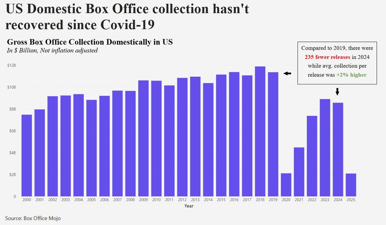
I recreated a visual showing the effects of Covid-19 on US cinema-goers using Vega-Lite in a Deneb custom visual in Power BI.
Inspiration & Background
Inspired by a chart in www.trendlineHQ.com, I recreated the following visual using Vega-Lite inside a Deneb custom visual in Power BI. The underlying data combines annual US Box Office receipts from 1977 onwards, sourced from Box Office Mojo.
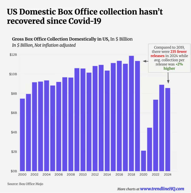
This was an interesting visual to me and showed simply the stark effect of COVID-19 on cinema-goers in the US. I also thought it was a nice simple remake to start with.
I felt the little caption / narrative emphasising the change from 2019 would be the tricky part and I wanted to investigate whether this was possible in Deneb.
Methodology
Design Notes
A measure was created in Power BI to sum up the total Box Office Gross value.
A bar mark was then used within Vega-Lite to create the column chart. This was encoded with the measure for the y-axis and the year for the x-axis.
A parameter was used in the config to hold the hex colour for the columns. This choice was made to aid flexibility: If I want to switch colours in future, this only needs changing in the configuration, I don't need to go through the specification. This was then referenced in the mark.
By default the x-axis labels were displayed at 45 degrees to the horizontal. I changed this angle to 0 degrees to aid readability as I'm not a fan of having to tilt my head to read these!
Challenges
Since the dataset began in 1977, a transform.filter was used to ensure the x-axis began with the year 2000 to mimic the original.
A title was added as well as a subtitle. The value of these were strings.
The formatting of the y-axis needed to reflect the fact that it was a currency and, in addition, was quoted in billions. This was achieved using a label expression in the axisY property in the config. This expression said if the label value is zero, return that value, otherwise append '$' to the formatted value.
The last thing was the arrows which are made using point marks and certain styles I defined in the config. We created two styles ( _arrowdown and _arrowleft ) and then in the specification, layered two point marks with the bar mark. The point marks would then reference each of the styles created.
Compromises
There were a couple of things outside the scope of Deneb. It is only possible to have one title and one subtitle per visual so I was unable to create the three lines of titling as per the original. Or rather I was unable to format three lines in three different ways. Hence the headline is actually a Power BI card.
The narrative on the right hand side was also not possible in Deneb. It is not possible to format a substring in a different way to the rest of the string. This is also not possible in native Power BI. To achieve this with the red and green text colouring I used another custom visual called HTML Content which allows you to write in HTML with inline CSS styling and positioned this above the Deneb visual.
Outcome
Vega-Lite Code & Config
You can view the full Vega-Lite config and specification below:
US Domestic Box Office Collection - Vega-Lite ConfigUS Domestic Box Office Collection - Vega-Lite Specification
Back to top of page
Game of Thrones Episode Ratings - Deneb Remake #2
27-05-2025
Summary
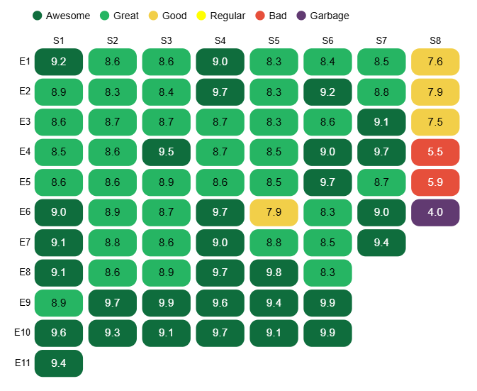
A heatmap seen on Threads displaying the ratings for every episode of every series was recreated using Vega-Lite inside a Deneb custom visual in Power BI.
Inspiration & Background
I found this chart (Game Of Thrones) on the Information is Beautiful Twitter / X page showing the ratings for each episode of every season of Game Of Thrones in heat map form. Although I'm not a Game Of Thrones fan, the visual intrigued me and having little experience of building heat maps, I thought this would make an interesting task to re-create using Vega-Lite inside a Deneb custom visual in Power BI.
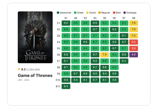
The visual is a two-dimensional chart (episodes on y-axis, series' on x-axis) displaying a rating out of 10 for each series/episode combination. Additionally the ratings are 'bucketed' and colour-coded based on their rating category. The image also has a cover image and title on the left hand side but this doesn't form part of this remake.
Methodology
My first step was creating the raw data manually since I couldn't access the original source of the data. As part of the import process I then used Power Query to unpivot the data to provide 3 columns of data: Series, Episode and Rating which I could then use in the visual.
The remake required layering two charts to give the appearance of one, a very common technique in Vega-Lite inside Deneb: one to create the heat map rectangles and then another to overlay the rating labels in each rectangle.
Design Notes
The first thing to do was to create the heat map shapes. This was done using a rect mark. I then used a text mark to display the text for the ratings in each rectangle, the two marks being layered together in the code and sharing the x and y co-ordinate encodings.
I then used conditional formatting to colour the rectangles according to the buckets and also to colour the text black or white according to the rating.
Challenges
Y Axis
One of the first challenges I encountered was two-fold and involved the y axis. Firstly how do I prefix the axis labels to show the 'E'? And secondly, once I'd achieved that, how could I sort them into the correct order given they are no longer purely numeric labels?
The solution is fairly straightforward in Vega-Lite, once you know how! We create a transform.calculate expression to solve the first part. A transform.calculate is similar to a calculated column in Power BI: this idea of deriving a new column in the dataset using a calculation based on an existing column or columns.
So in this case, we create a new 'calculated column' called YAxisLabel which is the character 'E' prefixed on the episode number.
This YAxisLabel calculated column is then used in the y-axis encoding which brings us to our second problem. By default this will then have the incorrect sort order because, for example, Vega-Lite thinks that 'E10' and 'E11' come before 'E2'.
To resolve this issue, we can use the sort property of the y encoding. This allows us to sort by the Episode field (which is purely numeric) in an ascending order. Pretty neat!
Colour Legend
The next challenge came in colouring the rectangle shapes based on the episode rating. The first step here was to understand the thresholds for the various categories. For instance identifying that an episode was considered 'Awesome' if it had a rating over 9 or a 'Bad' episode garnered a rating of between 5 and 6, for example.
Once the thresholds were understood, another transform.calculate was used to create a new 'calculated column' called 'Rating Category'. In Power BI language, the Rating Category was essentially a SWITCH statement (or a series of IF statements) which returns the category depending on the rating score.
This Rating Category column was then used in the color encoding channel of the rect mark.
Font Colour
Now that we have coloured all the rectangles according to the episode rating, this meant that some of the text displaying the rating on the rectangle became hard to read. Dark colour on a dark background or conversely a light colour on a light background. To resolve this, I would need to introduce some conditional logic that says: if the rectangle colour is dark, then use white for the text, otherwise use black.
I introduced this logic in the color encoding of the text mark by using a condition / test expression where I said if the rating was less than 6 or above 9, then use white text otherwise use black text.
Compromises
There were no real compromises that needed to be made to achieve a decent reproduction of the original visual. I was very pleased with how straightforward the task turned out to be and with how close to the original the end result was.
Outcome
Vega-Lite Code & Config
You can view the full Vega-Lite config and specification below:
Game Of Thrones Episode Ratings - Vega-Lite ConfigGame Of Thrones Episode Ratings - Vega-Lite Specification
Back to top of page
Digital Nomads: Where Should You Go? - Deneb Remake #3
05-06-2025
Summary
A scatterplot seen on trendlineHQ displaying, for a number of countries which offer a Digital Nomad visa, the Cost of Living Index vs Fixed Internet Speed was recreated using Vega-Lite inside a Deneb custom visual in Power BI.
Inspiration & Background
I found this chart (Best Countries for Digital Nomads) on the TrendlineHQ website showing the Cost of Living Index vs the Fixed Internet Speed for a selection of countries which offer a Digital Nomad visa. A Digital Nomad is a term I was familiar with and essentially represents someone who can work from anywhere only requiring an internet connection. So this chart was, in my view, ranking the attractiveness of countries which offer such a visa to foreigners. High internet connection with a low cost of living being the ideal.
I have always been an avid traveller and pre-kids and pre-mortgage the idea of being a Digital Nomad and living in another culture had its appeal for me, hence the interest in this chart!
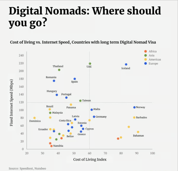
The visual is a two-dimensional chart (fixed Internet speed on y-axis, Cost of Living Index value on the x-axis) with each point identifying where a specific country (which offers the Digital Nomad visa) sits in relation to the other countries. Additionally the ratings are grouped and colour-coded according to the continent that they belong to. The visual has a large heading used to attract interest and a smaller subheading detailing what the visual is displaying.
Methodology
The raw data for this came from two different sources. I used Power Query to merge (or join) the datasets together based on the country.
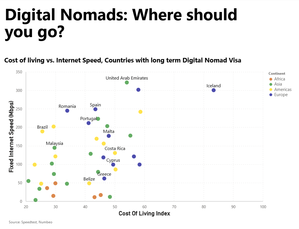
The main visual was again made up of two marks in Vega-Lite: one for the points and another overlaid for the country labels.
Design Notes
Point mark
I began with the point mark which defined both axes and each country's position. By default the points were hollow so I ensured they were more true to the original by, in the config, setting the filled property for all point marks to true.
I then ensured they were grouped by continent by setting the colour encoding channel to be determined by the Continent field. However these colours are arbitrarily chosen by Vega-Lite and I wanted to ensure they matched the original. To do this, within the colour encoding channel, I used the scale property. The scale property used in this way allows us to map a domain of values (which comes from the source data) to a range (which appears in the visual). It is a very handy way to map data categories to visual categories and maintain control over what appears in the visual. In this case our domain is the list of continents and our range is the list of colours that we want these continents to be.
Text marks
At this point, we have a visual with points representing countries grouped in colour based on their continent. However there are no labels so we do not know which point represents which country. So I now layered a text mark with the text encoding to be the Country field (for a select number of points). This provides the user with the name of the country in the visual. Having a label for all countries would overwhelm the visual (and the user) and would achieve the opposite of what is desired. This mark has an x encoding of Cost of Living and a y encoding of Internet Speed (together with a small y offset) so it appears next to the point it represents. I had a hard time finding a nice elegant way to include only select countries in this mark. In the end I created a transform.calculate field which compared the current value of the Country field (datum.Country) against a list of country strings and returned true if it matched one or false otherwise. I then filtered by this field in the mark to only return a country name if this calculated field was true.
Three supplementary text marks were also used for the chart title, the subtitle and the Source details at the bottom. Since none of these marks is dependent on the data, we used a blank dataset as the data source within each of these marks.
Tooltip
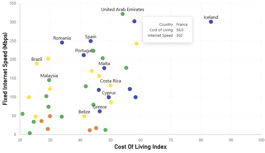
While I was building this visual I found myself wondering which country each point represented so, in order to make this easier for the user, I added a tooltip to the visual. This was added as an encoding to the original point mark and is made up of the 3 fields: Country, Cost of Living and Internet Speed with the latter two formatted such that the Cost of Living has one decimal place and the Internet Speed as a whole.

Challenges
Country List
Identifying the list of countries in the raw data and replicating all of these was difficult since the original visual only had labels for certain countries! In addition the article was from 2 years ago, and the data I used was more recent and therefore the values for both Cost of Living and in particular Internet Speed will have been different.
Selective Labelling
The next issue I had was the selective labelling. Could I find an elegant way to identify the countries that should have a label and those that shouldn't? I solved this problem but in rather a brute-force kind of way as the code will show. I'm sure there must be a better way to do this.
X Axis
The X Axis for the original visual started from 20 rather than from 0. I'd never encountered this before so had to do some reading of the documentation to understand how to resolve.
The solution is again using the scale property in the x encoding for the point mark. We set the domain to be [20, 100] and the range is defined as 'width'. What this is doing is saying we want the width of the x axis to cover x values from the data ranging from 20 to 100 only.
Compromises
Label Positioning
The main compromise in the report is the fact that the country labels all appear in the same position relative to the point (i.e. above the point). This compares with the original visual where, for example, the Bahamas label is below the point but Namibia is to the right of the point.
Outcome
Vega-Lite Code & Config
You can view the full Vega-Lite config and specification below:
Digital Nomads: Where Should You Go? - Vega-Lite ConfigDigital Nomads: Where Should You Go? - Vega-Lite Specification
Back to top of page
Men Speak Most in Best Picture Winning Films - Deneb Remake #4
09-06-2025
Summary
A bar chart displaying the proportion of words spoken between males and females in Best Picture winning films was recreated using Vega-Lite inside a Deneb custom visual in Power BI.
Inspiration & Background
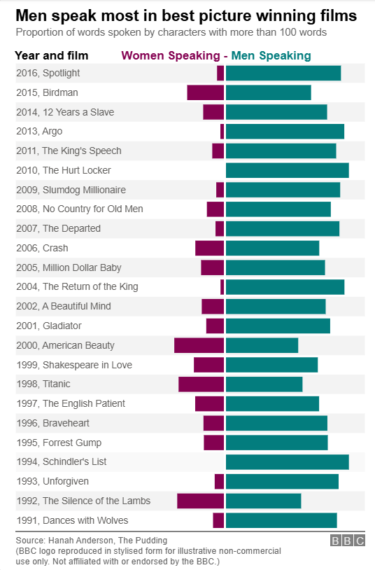
I came across this chart and was immediately struck by the powerful message it conveyed. The fact that the film considered the Best Picture year after year had substantially more dialogue from male actors than female ones was both fascinating but from a sociological point of view a bit troubling.
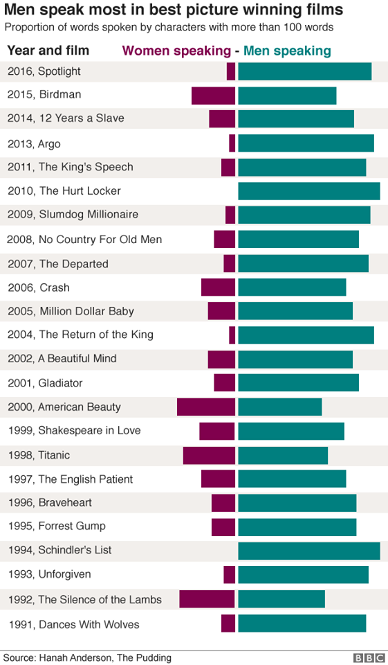
The visual is a divergent bar chart showing, for each winning film, the percentage of all dialogue spoken by females and spoken by males considering only characters who spoke more than 100 words. The visual has an attention-grabbing title and a smaller subheading detailing what the visual is displaying.
The technical makeup of the divergent bar chart piqued my interest, particularly the gap between the origin of each of the bars and also the coloured legend above the visual.
Methodology
The raw data for this came from two different CSVs. One held the character information (name, gender, age and which film they were in) and the second the film information (title, year, whether it won best picture and a link to the character info). I enhanced the films raw data in two main ways:
- Filtering out all films which did not win Best Picture.
- Adding an index column starting from 1 and incrementing 1 for each row of data.
The main visual was made up of three marks layered in Vega-Lite: one bar mark for the bars, one rect mark for the alternate horizontal grey shading and one rule mark at x=0 to create the 'gap' between the male and female bars.
Design Notes
Divergent Bars
I began with a bar mark which had the percentage of words spoken on the x axis and the film title on the y axis. A transform.calculate was used so that when the gender was female, the values would be negative. This allowed me to plot the genders in opposite directions, thereby creating a divergent bar chart.
I used encoding.color based on gender to give the bars relating to each gender a different colour. The size of the bars was also adjusted (thereby increasing the space between them) using encoding.size to give a similar look to the original.
Gap Between Bars at x=0
The original visualisation has a gap between the starting point for each of the gender bars. To create this illusion, I layered a rule mark on top of the bar mark. This rule took a value of x=0 and a colour of white and was given a broad strokeWidth. This results in a vertical white line at x=0 giving the illusion of spacing or a gap between the gender bars.
Headline and Subheadline
These were done as text marks in the layer with fixed encodings for both x and y position. And a fixed text encoding to return the text shown in the relevant colour.
This mark was part of the layer but does not depend upon the dataset. This means it will always show in the same position on the page regardless of the data which is perfect for headline text.
Attribution
A similar approach was taken for the source text at the bottom of the visual. A text mark with fixed x and y encodings was used for the text with a rule mark with fixed x and y for the horizontal line.
Challenges
Percentage Bars
The length of the bars represent the proportion for that gender of all words per film rather than a total count which is what the Power BI measure computed.
Remember that each film has two rows in the dataset, one for each gender so my thinking here was that we have the number of words per film for each gender in each row but not the total words per film. To achieve this I needed to add the total words per film into the data and then divide one by the other on a row by row basis to get the female and male proportions. In Vega-Lite the way I did this was to use a joinaggregate to add a new column to the dataset which would calculate the total words per film. Then use a transform.calculate in the mark to divide the number of words per gender with this total words per film. And use this calculation on the x encoding as the field making sure to set the axis format to percentage.
Y Axis
The fact that the Y axis was a combination of two fields and was sorted in a certain order proved to be a challenge to get right.
The concatenation of two fields into one is something we've done in a previous remake. The approach is to use a transform.calculate to combine the year_best_picture, a comma and the film title to create the y-axis label. This was then used as the y-axis label on the y encoding however it still needed to be ordered in a certain way to match the original visual.
The way this was achieved was to sort this calculated field based on the year field (which is numeric) in a descending order. Because we're sorting one categorical field based on a numeric column Vega-Lite has a quirk where we need to tell it how to aggregate that numeric column. It doesn't assume that there will only be one value per category so it wants to be told how to aggregate them in case there's more than one. This happens in a fair few situations in DAX measures too so not an unfamiliar concept. I chose to use the operation 'max' which is usually my go-to in DAX as well.
Legend
This chart has an interesting legend which is essentially a title at the top of the chart using the same colour as the gender bars below to help the user identify the different genders.
I could not find an elegant way to add a legend or a title in this position. The solution therefore became the usual approach: adding a new text mark and setting the x and y encodings to be static values independent of the dataset. We could then apply bold styling and the colour to match the bar beneath.
Alternate Shading
Yet another challenge was the alternate shading and, to be honest, I wasn't even sure it was possible with Vega-Lite initially.
The solution required both Power Query and Vega-Lite. The idea is that you create a grey rect mark behind the existing divergent bar chart but only for alternate rows. The y encoding will be the films just like the divergent bar chart but the x encoding would just be the width of the chart, using a static value for x and another static value for x2.
So the first step is to add an Index column in Power Query to the film table (an Index column starts with 0 or 1 in the first row and increments by a value of 1 for each row). This then gives us a way to identify alternate rows.
This way is by using the modulo operator. This operator returns the remainder when a value is divided by another (specified) value. So if we take a value and apply modulo 2 to it, the result will be the remainder when that value is divided by 2. This allows us to distinguish between odd and even values.
Within the Vega-Lite code I added a new mark with a transform.calculate used to identify the odd rows as opposed to the even rows. This is then used in the calculation to filter the dataset within the mark so now the dataset consists of only the odd rows that we are interested in. At this point I then add the rect mark with low opacity so it blends more into the background.
Compromises
BBC Logo Facsimile
The original chart featured a prominent BBC logo. I wanted to capture the same visual appearance, so I recreated a stylised version using three rect marks in Vega-Lite to represent the iconic BBC blocks and another three to represent the text within. While the font and proportions aren’t exact, this approach conveys the same design intent without relying on external images or assets. Since this is a personal project and non-commercial in nature, I felt comfortable including a close reproduction for illustrative purposes. A short disclaimer has been added to the visual for clarity.
Outcome
Vega-Lite Code & Config
You can view the full Vega-Lite config and specification below:
Men Speak Most in Best Picture Winning Films - Vega-Lite ConfigMen Speak Most in Best Picture Winning Films - Vega-Lite Specification
Disclaimer: A stylised version of the BBC logo is used above for illustrative, non-commercial purposes. This project is not affiliated with or endorsed by the BBC.
Back to top of page
World 4G Coverage - Deneb Remake #5
26-06-2025
Summary
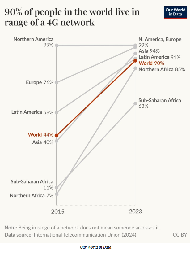
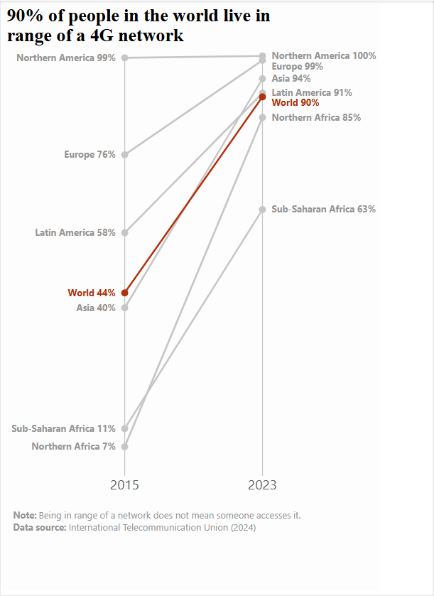
A slope graph comparing the proportion of the world's population (grouped into geographical regions) who live within range of a 4G network in 2015 and 2023 was recreated using Vega-Lite inside a Deneb custom visual in Power BI.
Inspiration & Background
I recently bought a new phone which has 5G capability so this got me thinking about network coverage. When I came across this visual I was instantly interested. As a Western European I think we can take for granted how 'connected' we are and it was grounding to see it wasn't necessarily the case world-wide. Having said that it was uplifting to also see the technological advances we, as a population, have made over a short time span.
Methodology
The raw data for this chart came from a single CSV file which other than some nominal cleaning in Power Query was good to go.
The main visual is made up of two marks in Vega-Lite: one line mark for the slope graph and one rule mark for the grey vertical lines at 2015 and 2023.
Design Notes
Line Mark
The main slope visual is plotted using a line mark. The dataset is first filtered down to only include data where year is 2015 or year is 2023. I also added a filled point to this line which I made larger than the default so the ends of the line are indicated with a grey circle.
The original chart had all the lines in grey with the "World" line contrasting in a red colour. To replicate this, I used the colour encoding channel with a condition which basically said "if the entity is World set the colour to red otherwise grey."
Multi Series Line Chart
The standard way to tell Vega-Lite to plot separate lines is to use the encoding.color channel which then plots multiple lines and attributes a different colour to each line. However in this case since the lines are mostly all grey I had to use a different approach. So I used the encoding.detail channel to tell Vega-Lite to plot a separate line per entity (i.e. geographic region).
Headline
The headline text was created using a text mark within the layer based on an empty dataset. An approach I have used in other remakes. Using a blank dataset like this allows the text mark to be completely independent of the underlying data, making it perfect for fixed-position text. It is then a case of hardcoding the x and y position for this text and also hardcoding the value of the text.
Challenges
Vertical Lines at 2015 & 2023
As well as the slope graph between 2015 and 2023, I also needed to create vertical lines at x=2015 and x=2023. This was more difficult than I first imagined!
The solution / trick I came up with is to add a rule mark to the same layer but rather than use the original dataset or even use a transform.filter we actually set the dataset explicitly as only years 2015 and 2023 by using an array within the dataset.values property.
Notes Beneath Visual
Again these notes beneath the visual were not as straightforward to construct as I initially thought. The reason for this is the different font weight - I don't believe it's possible in a single text mark to have some of the text in bold font and some of it in normal font.
So I split out the text into different text marks: The word "Note" was in one text mark that I made bold and then the sentence "Being in range of a network does not mean someone accesses it" was in a separate text mark. And then these two text marks were aligned on the page in such a way to look like one. This approach was then repeated for the second line beneath the visual. The end result being four text marks to represent the two lines underneath the visual.
Data Label Construction
The data labels in the original visual are a concatenation of the geographic region and the percentage of 4G coverage. Recall that in Vega-Lite a transform.calculate is equivalent to a calculated column in Power BI. So we can use this to concatenate the entity column (which contains the geographic region data) and the population column (which I needed to format into a percentage) into a new column we called "Data Label". I then used this new column in the encoding.text channel to display the data labels as per the visual.
Compromises
Data Labels
If you look closely at the original visual, you'll see that the positioning of the data labels is not consistent for all points. Sometimes the text and the value are on the same line and sometimes the value is on a line beneath the text.
This approach was not something I replicated. This was because it is not a simple thing to achieve in Vega-Lite and I didn't believe the complexity was worth the effort required. I believe it could be done if we were to take a more atomic approach to the data labels. And, instead of doing them all in one text mark, we could create a series of text marks with a slightly different dataset (using transform.filter) to isolate each data label separately. We would then have one text mark per data label and be able to position each one exactly as per the original visual.
I didn't do this extra step. Instead I used one text mark for the data labels which still needed to be coded carefully in terms of placement. For instance, I needed to compute an x offset which would be negative if it was 2015 or positive if 2023 so that the labels appeared either to the left of the point (in 2015) or to the right (2023). In a similar vein, I also added some logic which would define whether the text label would be right aligned (in 2015) or left aligned (in 2023). And once again the colour encoding was used to show the "World" data label in a red tone and all others in grey. Even with this compromise, I don't think anything is lost from the meaning of the visual.
Outcome
Vega-Lite Code & Config
You can view the full Vega-Lite config and specification below:
World 4G Coverage - Vega-Lite ConfigWorld 4G Coverage - Vega-Lite Specification
Back to top of page
Ten Pin Bowling - Deneb Remake #6
07-07-2025
Summary
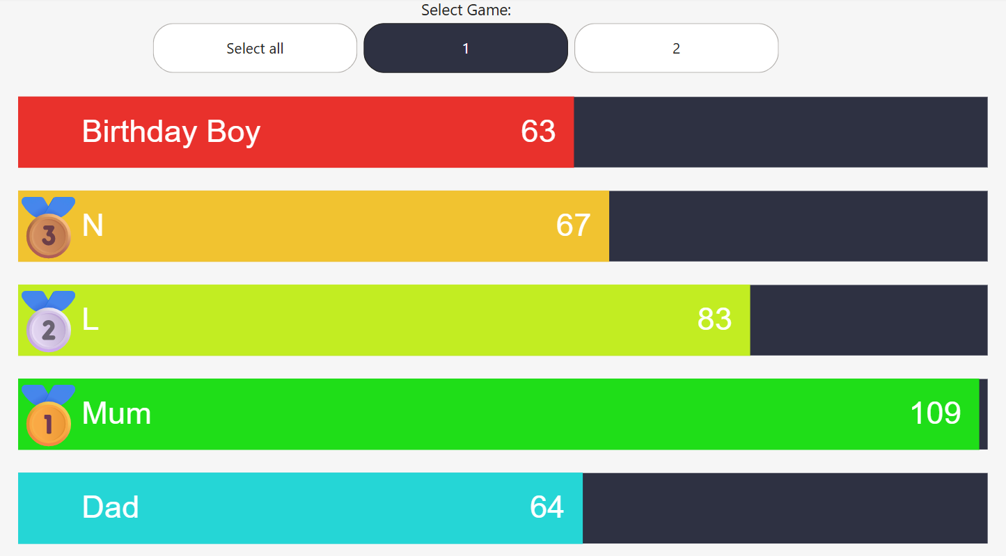
A bar chart showing the scores of individuals during a game or two of ten pin bowling.
Inspiration & Background
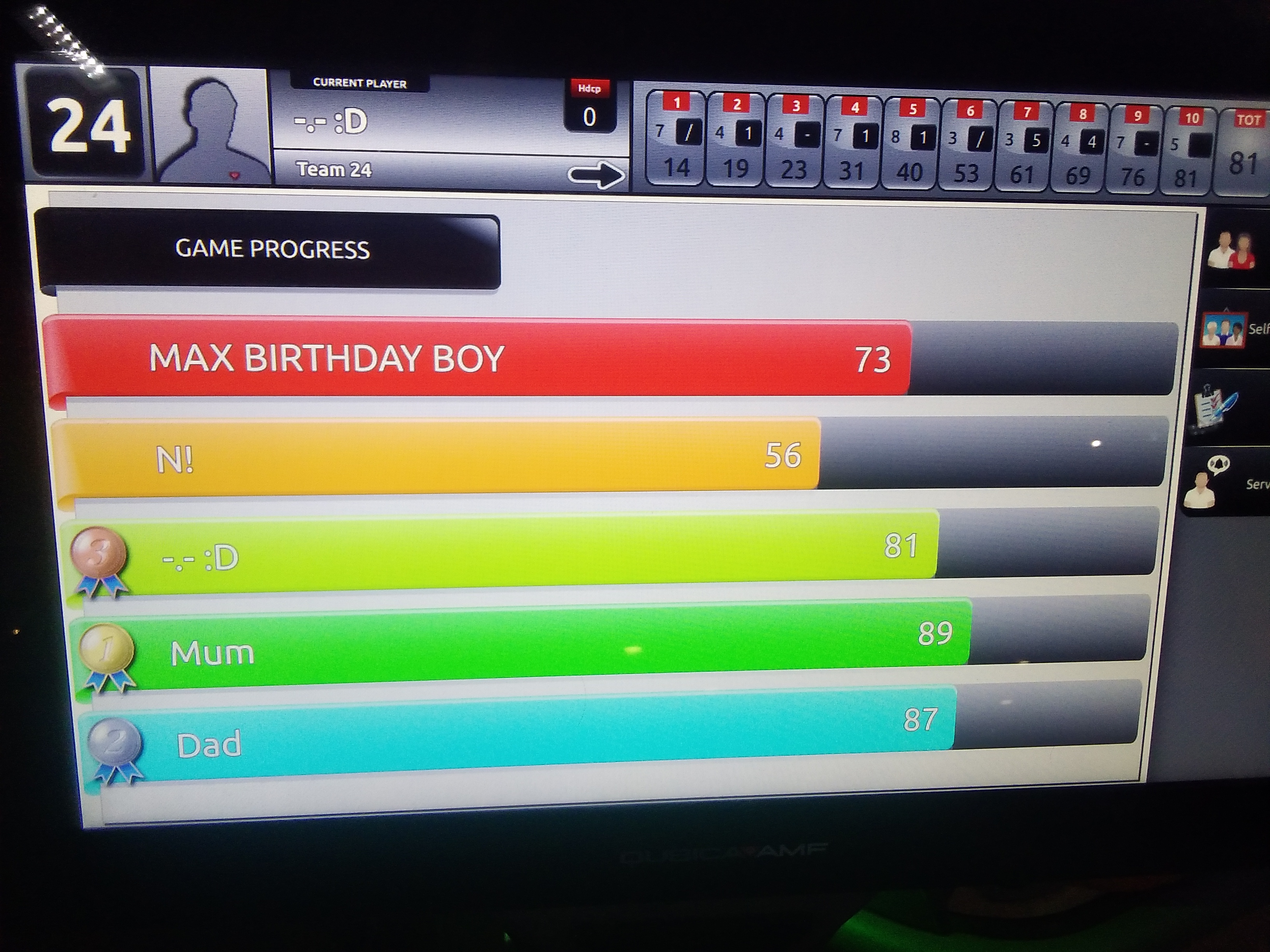
My son recently celebrated his 10th birthday. As part of the celebrations we went to the local 10 pin bowling place and played a couple of games. This graphic was on the screen showing us our scores and it made me wonder if I could re-create in Deneb
Methodology
The raw data for this chart was small. I got it from the day out at the bowling and then just came home and typed it in an Excel file. This was done in the same format as you'd see at the bowling, so a grid with names on the left and frames from 1 to 10 across the top.
In order to make the data useful for analysis I had to change the shape of the data which I did using Unpivot within Power Query. I then created a measure called Total_Score which was a sum of the score column.
The main visual is made up of five marks in Vega-Lite: two bar marks and three text marks.
Design Notes
Zebra Stripes
The main bar chart is created using a standard bar mark with an x encoding using the Total_Score measure.
The zebra stripes or dark navy background for this standard bar mark was provided by another bar mark. This time there was no value set for the x encoding so that it would span the whole width of the chart.
Names Label
A text mark was used to add names to each of the coloured bars. This was done using an x encoding of 80 and a left alignment so the names are all nicely aligned as is the norm with text. The reason an x value of 80 was chosen was to allow space to the left of this text but still on the bar to add the rankings in the form of the gold, silver, bronze medal images.
Data Labels
Similar to the names label, I created this using a text mark. This time I needed the scores on the right of the bar so I set a right alignment and set the x encoding to be the Total_Score measure. Finally, since the x encoding puts the text right at the end of the bar and I actually want it just inside the end, I used a negative xOffset to move the text within the end of the bar.
Addition of Slicer
As is normal for when you go bowling, we played two games. I wanted to be able to see the results of both games and also see an overall because these were the details that my family were interested in as well.
In order to do this, I enhanced the raw data by adding a Game column. This would be an integer, 1 or 2 in this case. The plan was then to have a slicer on the page, made up of this column which would allow the user to select the game they were interested in viewing (or because I had changed the slicer settings accordingly, they could also view the overall score across both games).
Challenges
Custom Sort Order
The sort order of people's names gave a bit of a challenge. The names weren't displayed in alphabetical order and they weren't in score order. Instead they were simply displayed in the order in which we typed them in, as in normal when you go bowling.
This meant that to ensure the correct scores were coded to the correct person, the y encoding each time would need to state this sort order. So, for example, when creating the main bar, the x encoding is the Total_Score measure, the y encoding is the Name field but then within that y encoding, I set the sort order explicitly as an array to match the order the names had been entered:
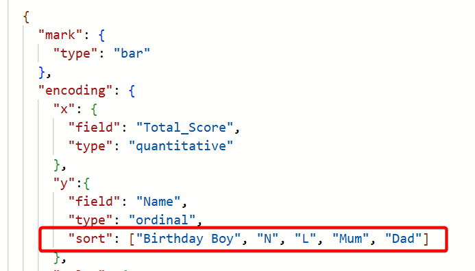
To get the bars to show the correct colours, a similar process needed to be followed for the color encoding. This time however, we wanted certain hex codes to be applied to certain bars. This is the perfect scenario to use encoding.color.scale.
I talked about using this attribute of the color encoding in remake #3 but by way of a recap, the scale property allows us to map a domain of values (which comes from the dataset) to a range (which appears in the visual). It is used to map data categories to visual categories.
In this case our domain is the list of people and our range is the hex colours we want the bars to display:

Dynamic Ranking
The requirement was that we would have medal icons showing at the start of the bar for the people in the top three. So a gold medal icon for the person in first, a silver medal icon for the person in second and a bronze medal icon for the person in third.
The methodology for doing this would be straightforward as we would use another text mark. The difficulty would be in calculating who was 1st, 2nd and 3rd. This puzzle was solved using a transform.window with a sort.
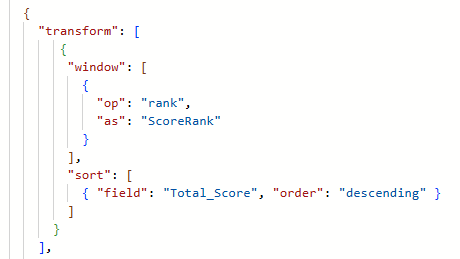
So the window operation allows us to add a column to the data (which we call ScoreRank) based on the operation of ranking. Every person in the data therefore gets a ranking based on their total score ordered in a descending fashion. The person with the highest score will get a ranking of 1.
Using this window of data we create our text mark but in the encoding.text we create a condition because we only want the text to appear if the person's score (and therefore rank) is in the top 3:

Compromises
Lack of Finesse on Visual
I was really pleased with the outcome and how close it was to the original. The only thing I did compromise on is that the bars on the original had a bit of extra detail on the left hand side to make them look less like bars and more like ribbons. I decided to avoid remaking this detail.
Outcome
Vega-Lite Code & Config
You can view the full Vega-Lite config and specification below:
Ten Pin Bowling - Vega-Lite ConfigTen Pin Bowling - Vega-Lite Specification